

 Cover image via
On 30 November 2022, Celcom and Digi merged to form a single corporate entity, CelcomDigi Berhad
Both Celcom and Digi have been trusted brands in Malaysia over the past three decades. Their merger came with a shared goal to innovate and empower Malaysians to achieve their dreams.
Now, 323 days after its merger, they have finally unveiled their new unified logo.
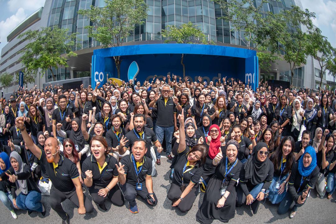
Image via CelcomDigi
In the new logo, CelcomDigi chose to stay with both of the brands' official colours, blue and yellow
Celcom and Digi are well known for their iconic blue and yellow, and they've chosen to maintain their brand identity Malaysians have grown familiar with.
In terms of design, the shape of the logo looks like a butterfly. At the same time, the letters D and C are visible, which represent the first alphabet of both companies.
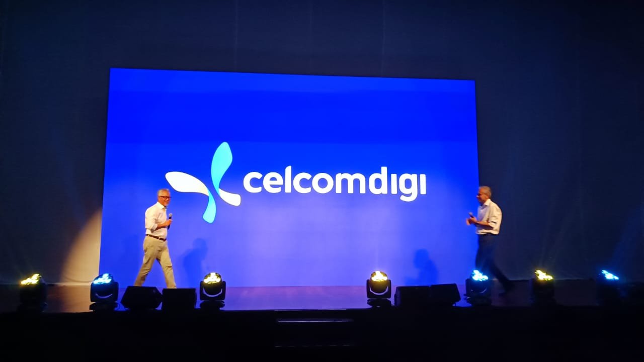
Image via Oriental Daily News
Despite the merger, existing physical Celcom and Digi stores will still run as separate brands. They will gradually migrate under the new brand, CelcomDigi
Since there are many customers still using Celcom and Digi separately, CelcomDigi continue to maintain legacy products. At the same time, the company also will start producing more products under the unified company such as its recent fibre offerings, where both the Celcom and Digi customers can enjoy its services.
In celebration of the new era of CelcomDigi, the brand is offering all kinds of special offers
For instance, you can now get up to RM1,000 in savings with the Programme Perantis 5G Untuk Semua. Aside from that, if you pair your postpaid plan with CelcomDigi Fibre, you can save 39% on a 75″ Samsung Smart TV.

Image via CelcomDigi
